Project title
Content Creation App For Football Clubs
Brand name
Assista
Project type
Personal
Project Genre
Branding & UI
Tools used
Project Content
 Logo
Logo
 Colors
 Icons
Icons
 Typography
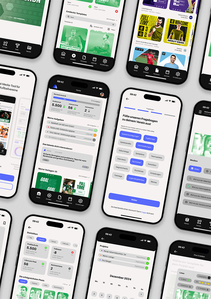
 App Screens
Project Description
As a part of my bachelor thesis, I developed the branding and concept for a mobile app that enables amateur football clubs to create consistent and professional social media content. The project focuses on user-centered design and empowers grassroots teams to strengthen their digital presence with ease.
Logo
The logo development process involved choosing a fan shape as a symbol due to its association with movement and its versatility in design. The shape was adjusted and simplified, incorporating the letter "A" and a stylized globe to reflect the brand identity. Final touches included rounding the corners to finalize the design.
Logo
Colors
The color selection focused on shades of blue—Vista Blue, Neon Blue, and Palatinate Blue—to create a monochromatic palette reflecting trust and success. These were used across elements like accents, buttons, and filters. Supporting colors like Snow and Night were used for text, and tones like Platinum and Silver helped distinguish boxed elements. Blue was chosen to align with football’s associations and convey reliability.
Primary Color
Vista Blue | #939FFC
Primary Color
Neon Blue | #576AFA
Primary Color
Palatinate Blue | #1130F7
Neutrals
Snow | #F6F2F2
Neutrals
Silver | #A7A7A7
Neutrals
Night | #121212
Icons
The project uses Forma Icons to ensure a clean and modern visual style. Forma Regular is applied in the default state for a minimal appearance, while Forma Bold Filled is used in the active state to create clear visual emphasis and improve user interaction.
Used Icons In Total
>50
Icons
Typography
Aileron is a modern sans-serif typeface inspired by Helvetica, with improved readability features like the curved lowercase “l.” Rounded punctuation and a soft spiral structure give it a gentle, approachable feel. Though similar in look to Helvetica, its design is conceptually closer to Univers.
Headlines
Aileron Regular
Body Text
Aileron Bold
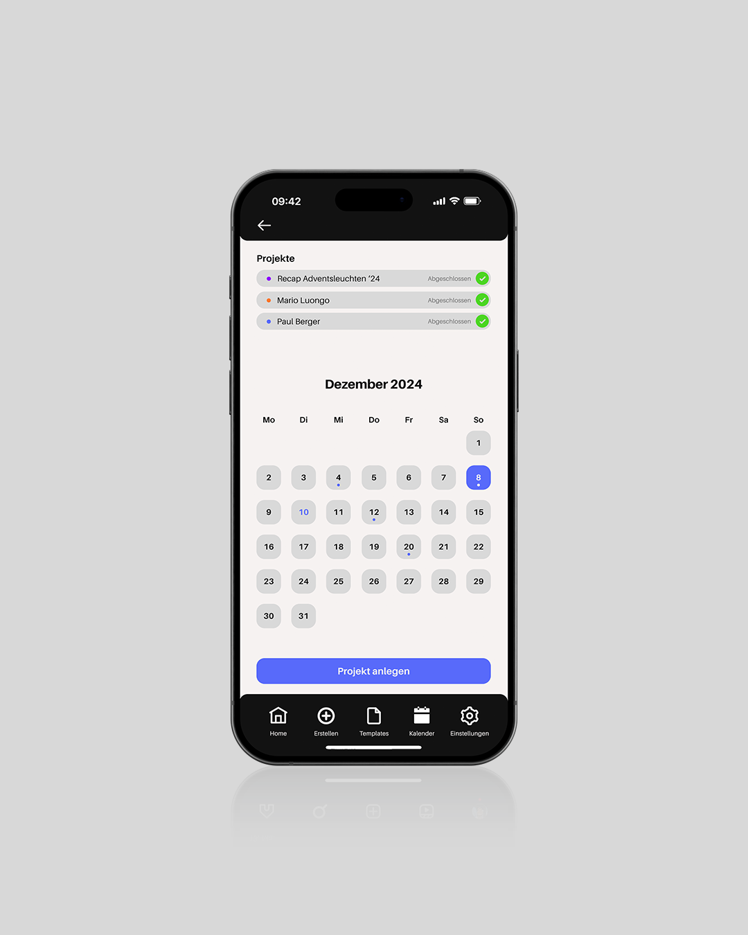
App Screens
Screens In Total
>200
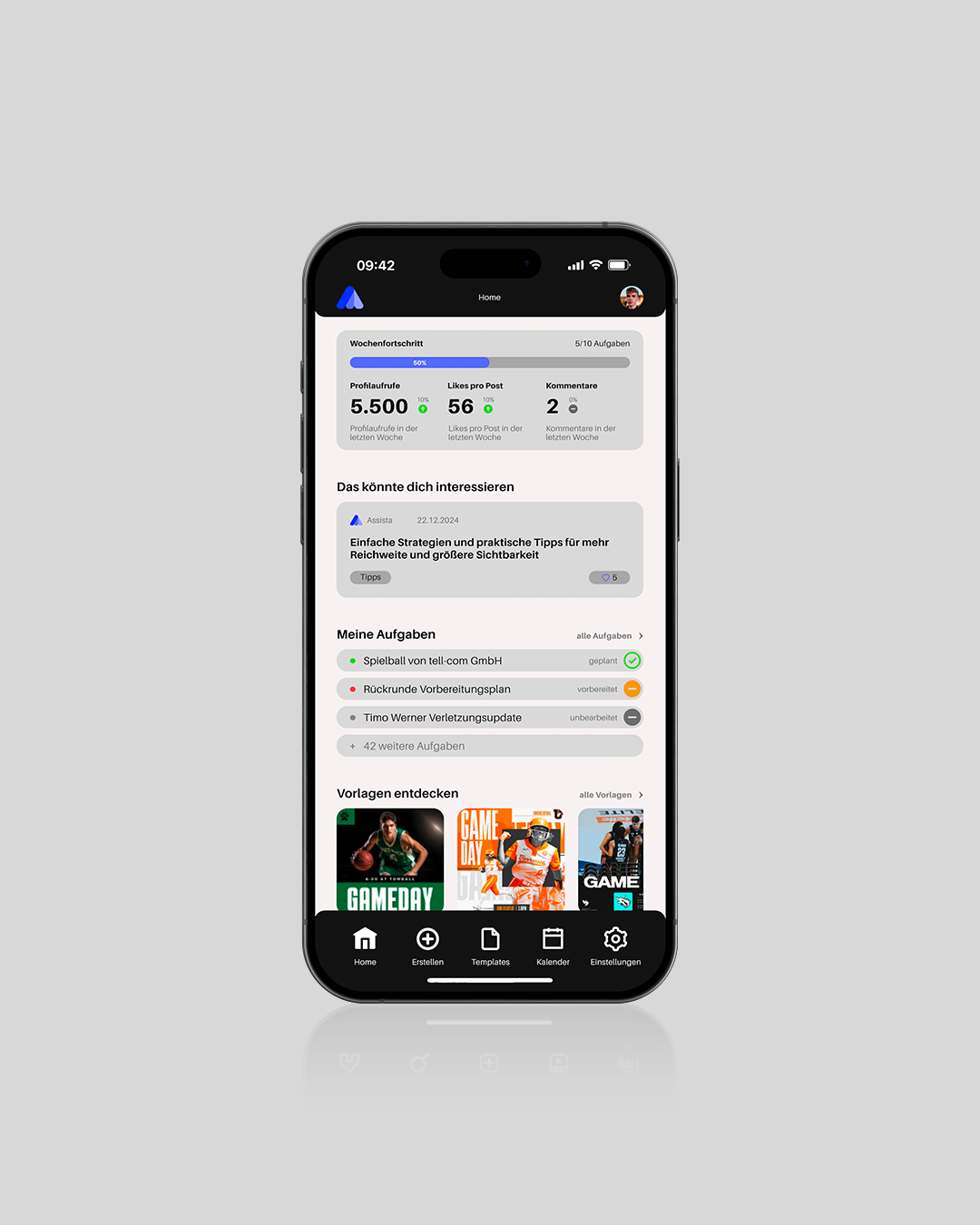
Home
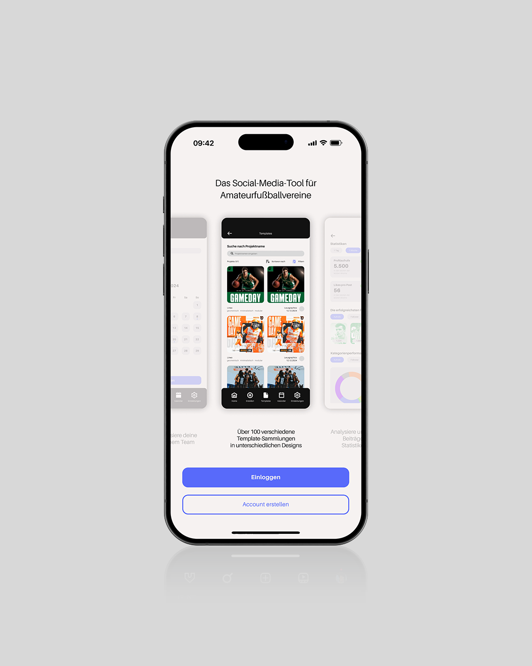
Onboarding
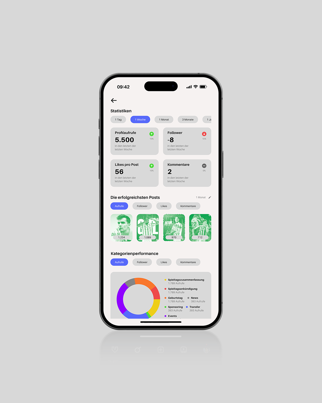
Statistics Dashboard
Calendar
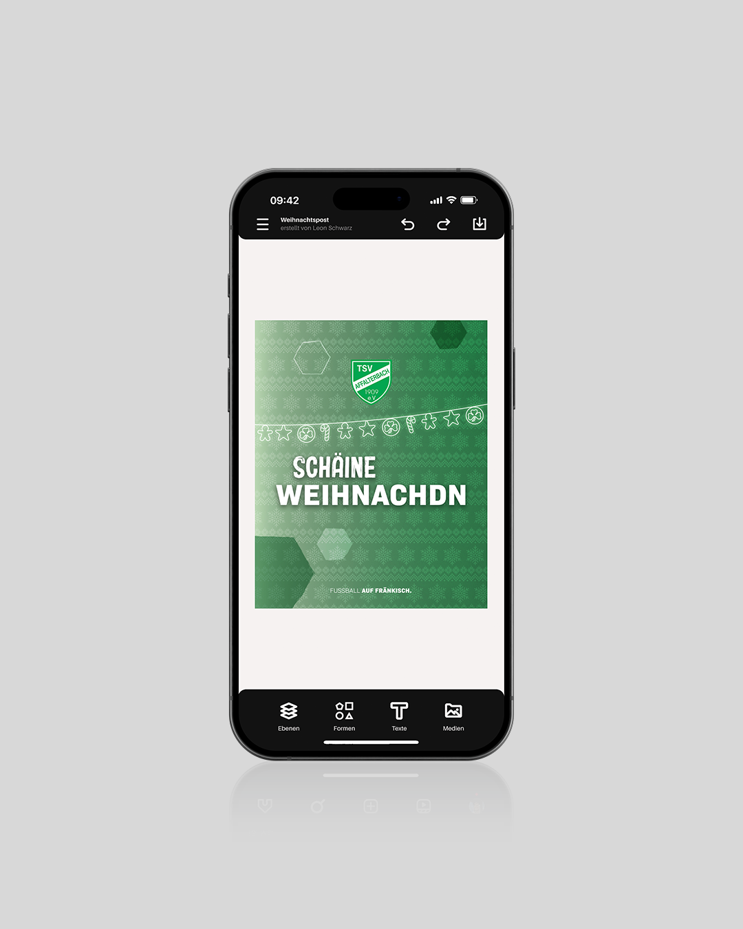
Editor